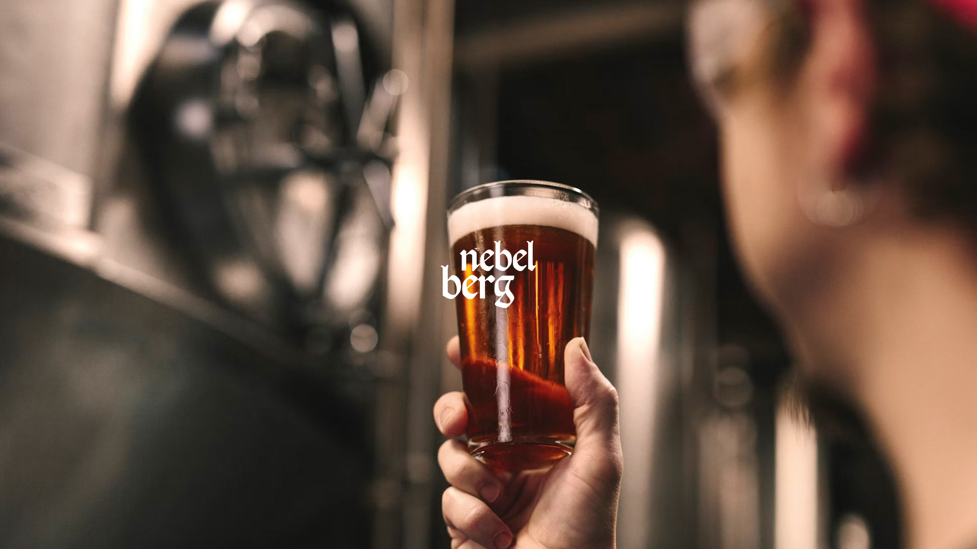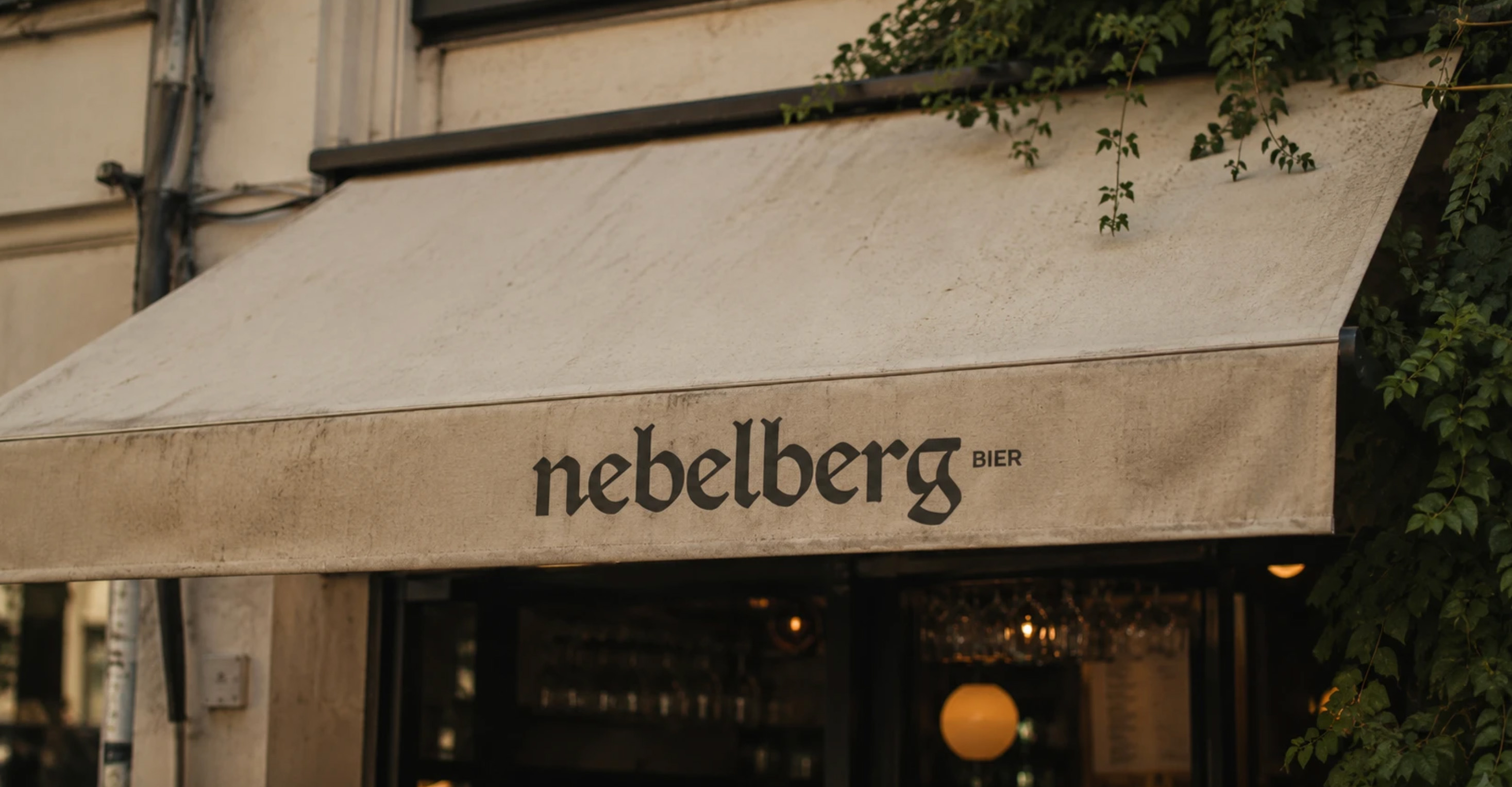
Rooted in the German traditions of immigrants who came to São Bento do Sul, Brazil, our craft beer brand has always celebrated authenticity and community. With deep cultural roots and a passion for brewing excellence, we've built a legacy that honors both the precision of our ancestors and the creativity of our hometown. However, as our audience evolves, so does our history—and it's time for our identity to evolve with it.
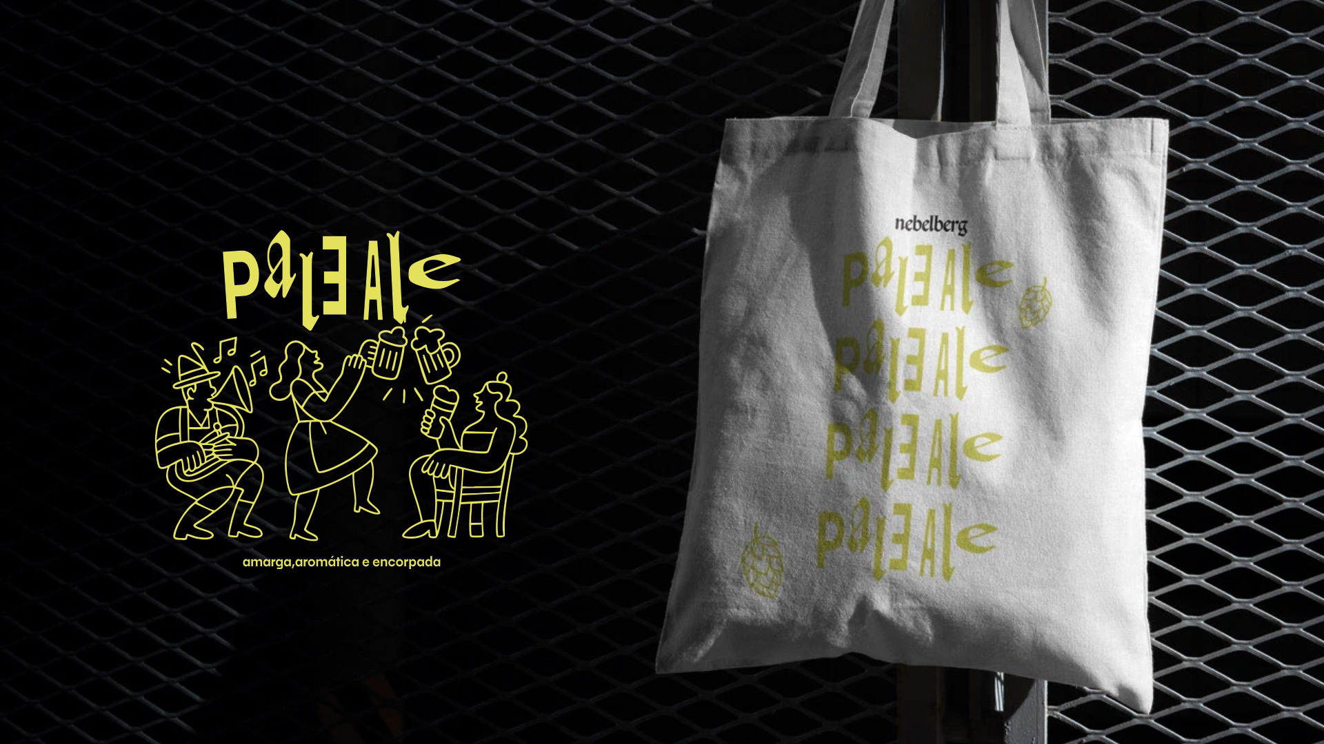
The new visual identity reimagines this heritage through a contemporary lens. Clean lines, bold typography, and vibrant colors bring a modern spirit to our classic foundation. This redesign bridges past and present, connecting tradition with innovation and inviting a new generation of beer lovers to experience the soul of São Bento do Sul. It's not just a new look, it's a renewed toast to authenticity, creativity, and the shared joy of good beer.
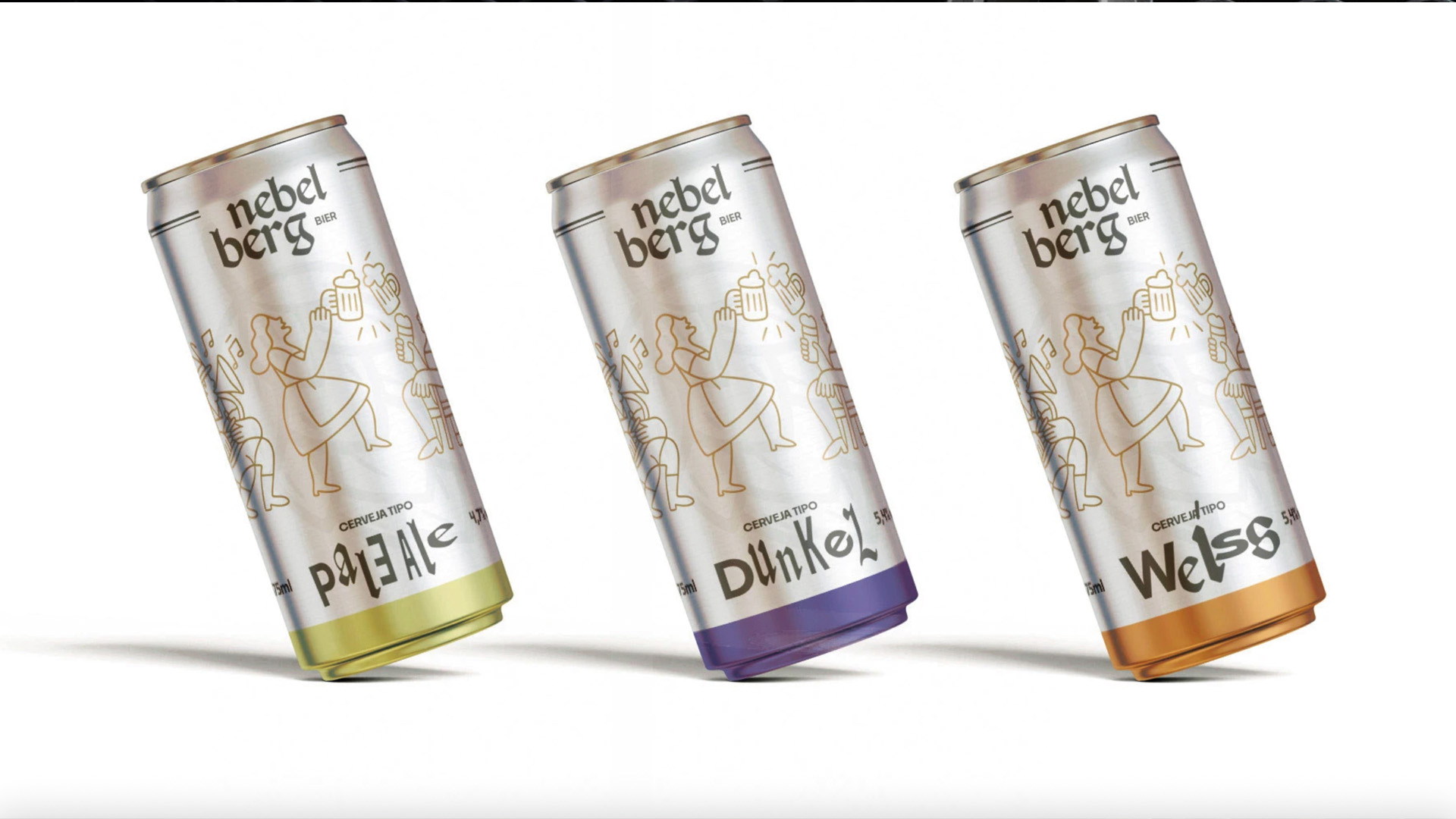
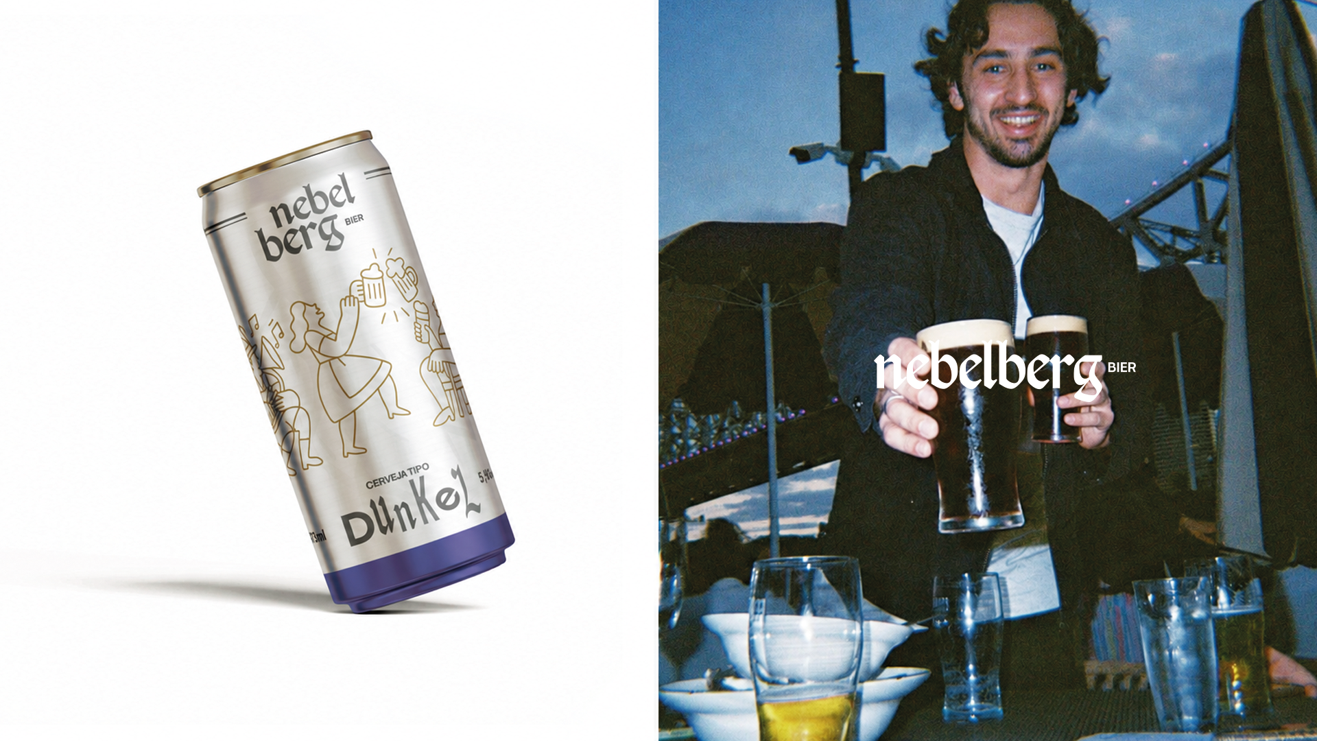
To guide this evolution, we kept the original typefaces intact a deliberate choice to preserve the brand's cultural fingerprint while rethinking how color and letter composition work together. Each beer now carries its own distinct color identity and typographic rhythm, making the lineup instantly recognizable on the shelf while still speaking the same visual language. The result is a livelier, more playful atmosphere, without losing the craftsmanship and heritage the brand was built on.
Throughout the process, we looked closely at the craft beer market studying labels and identities that manage to stand out from mass-market beer without chasing trends for their own sake. That research shaped our approach: contemporary enough to feel fresh and bold, but grounded enough to still feel like Nebel Berg.